Adsoft Visual Identity – Brand Design Case Study

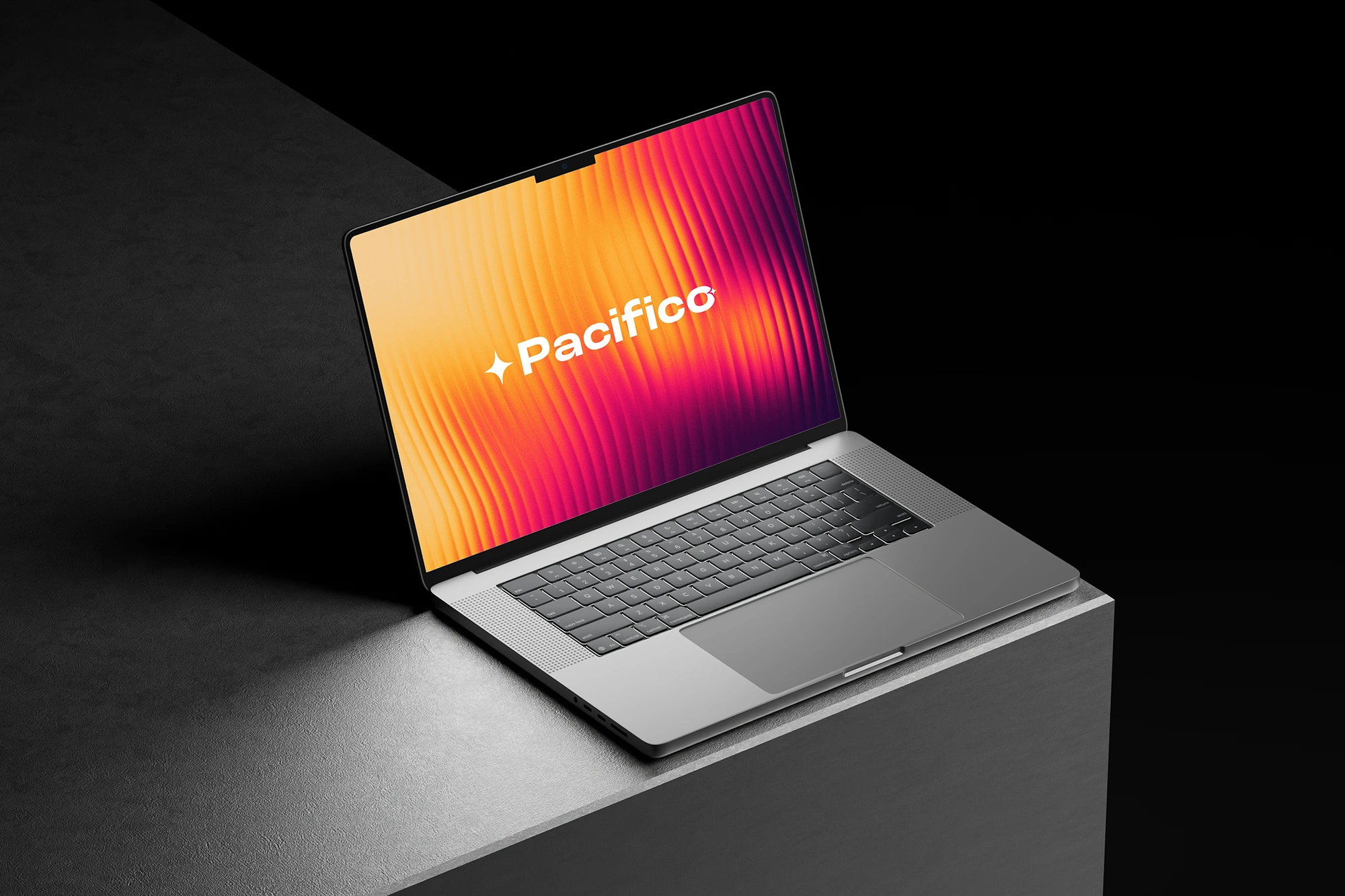
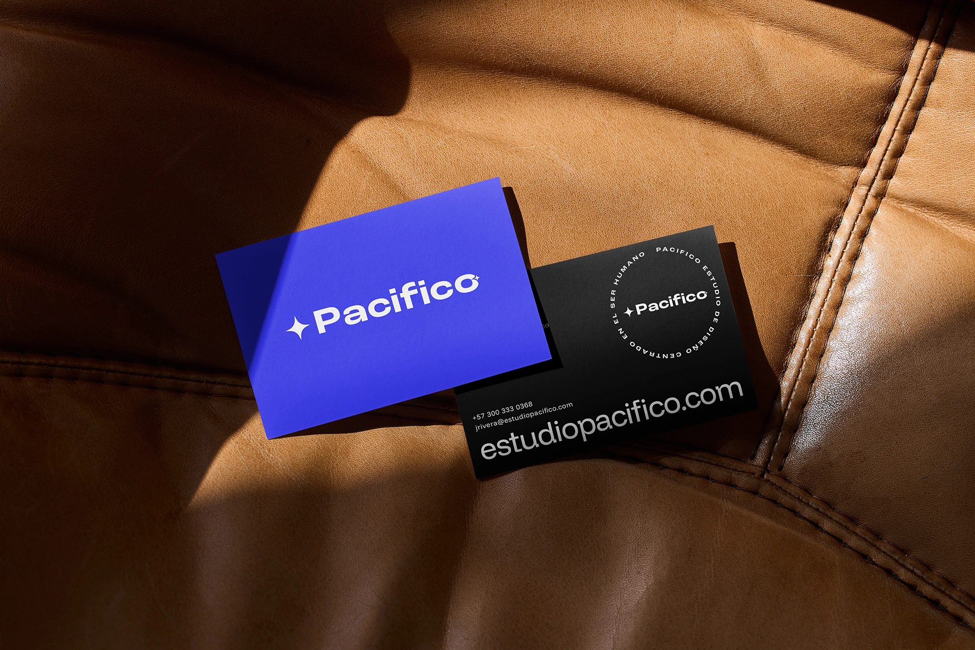
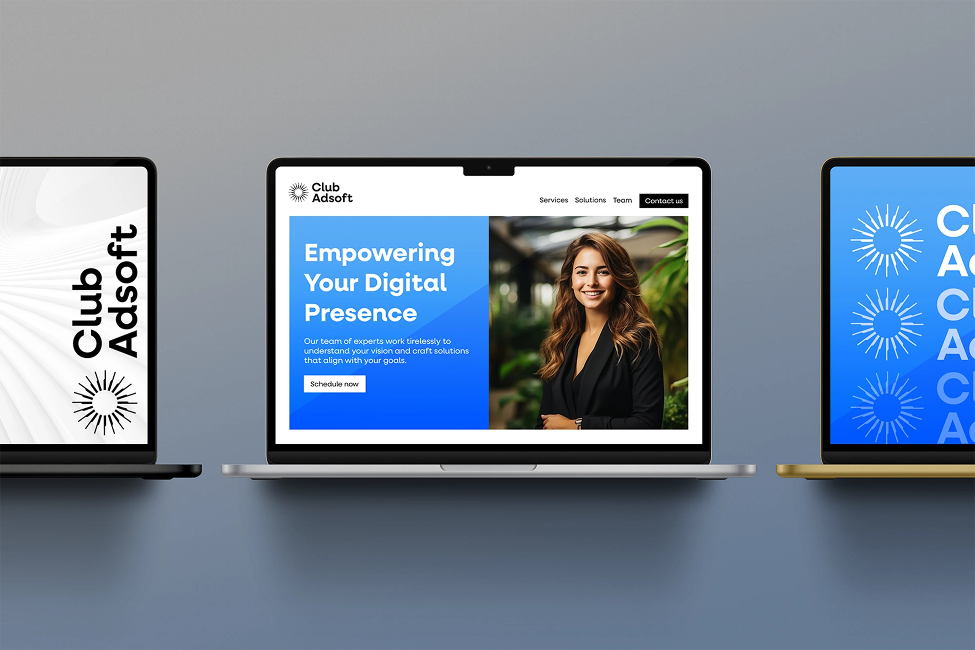
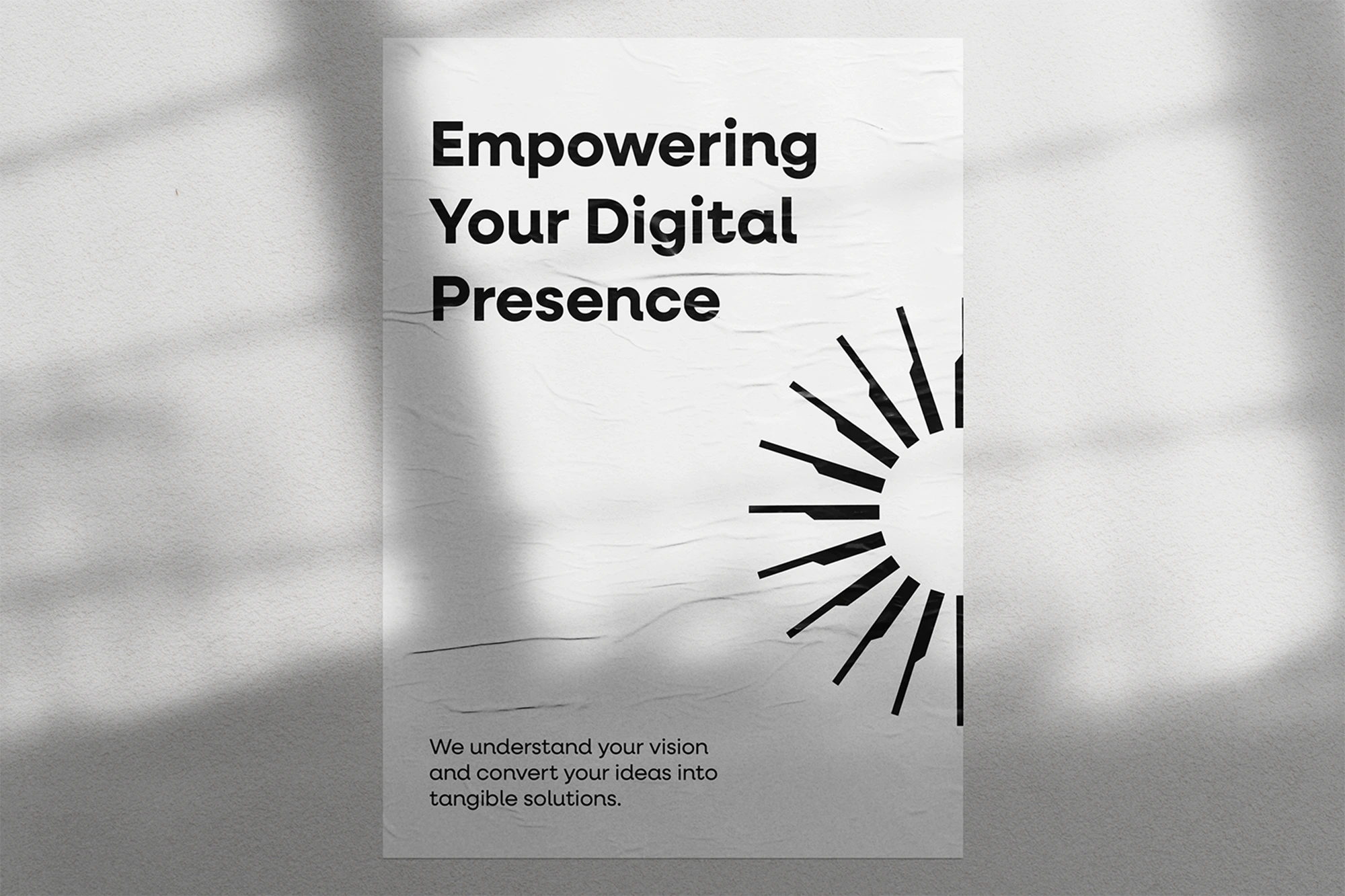
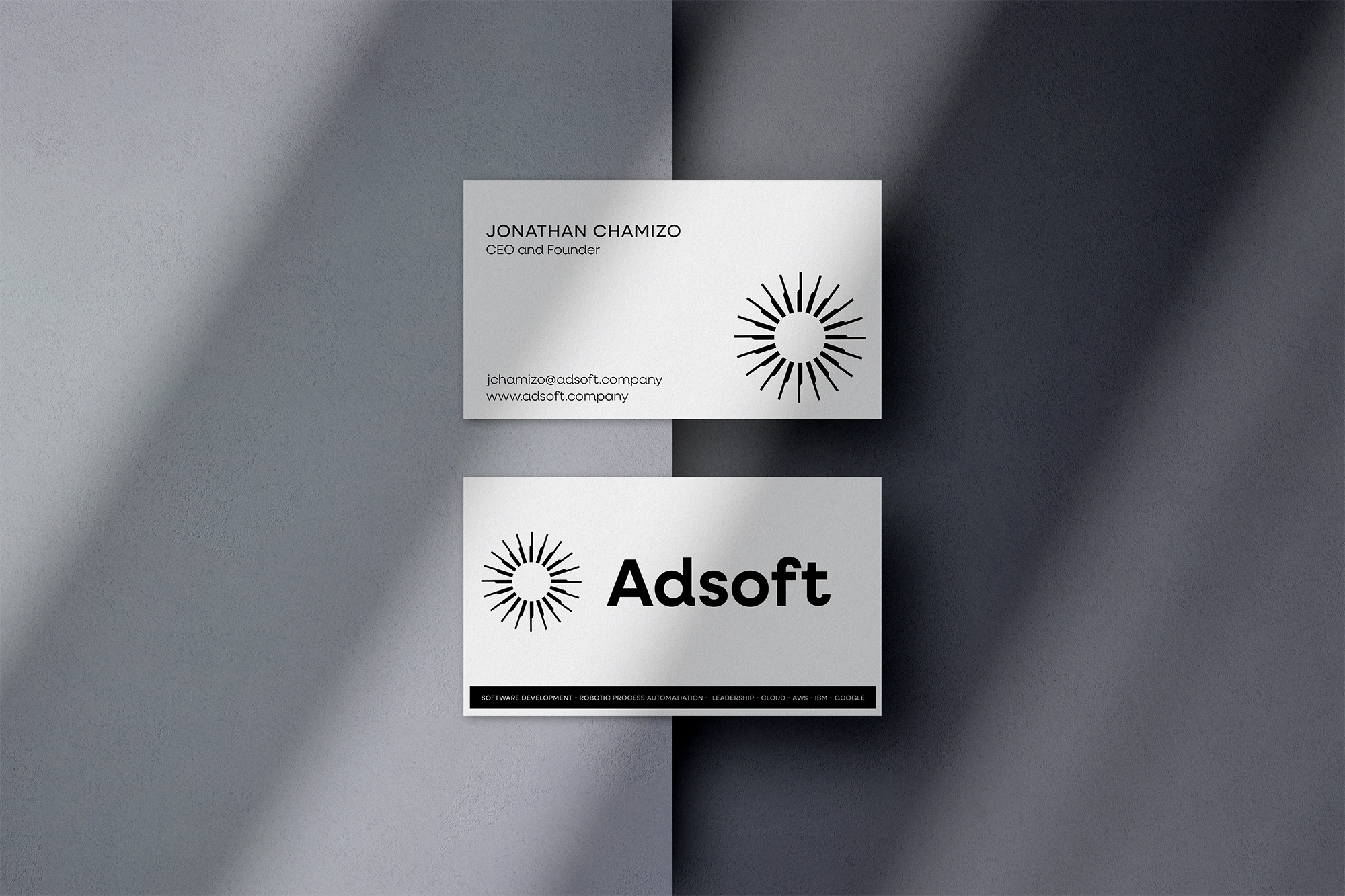
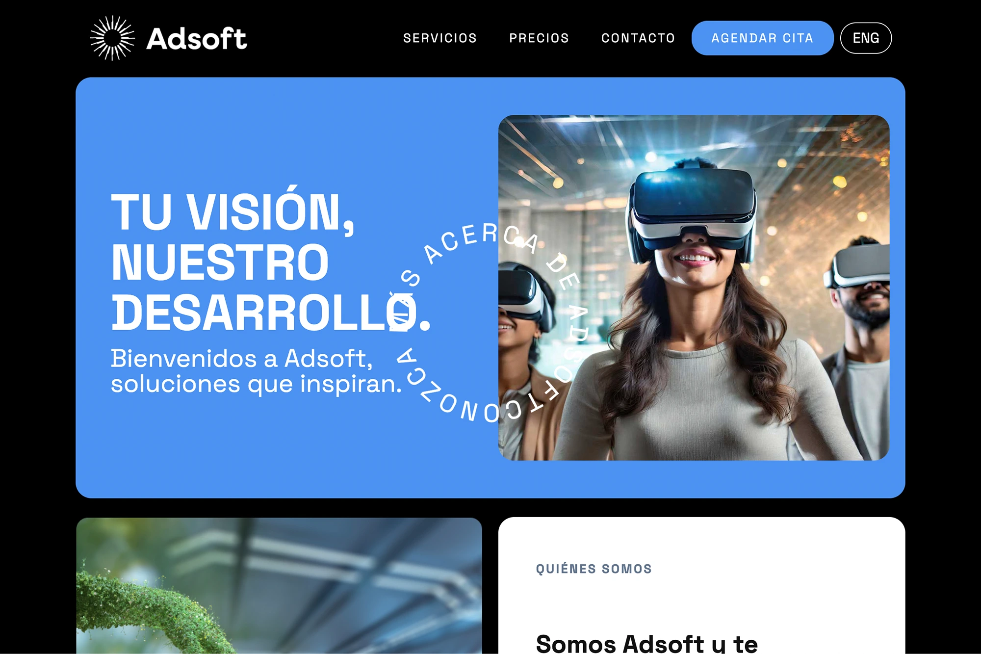
This visual identity case study explains how we redesigned the entire Adsoft brand system through a modern logo, refined typography, an optimized color palette, and consistent brand applications. In addition, the new identity strengthens recognition and communicates a more professional corporate image.

The Challenge

Adsoft initially contacted us with a clear objective: to design the interface and user experience for a Panamanian healthcare web application.
Adsoft faced an enormous challenge: its product was innovative, but its visual identity did not reflect its value or technological sophistication. The brand needed consistency, speed, and flawless execution.

Our Approach

The founder of Adsoft asked us for a rebranding because he felt amateurish, and his business began to grow after the successful rebranding we did.
The result was so positive that Adsoft decided to expand the relationship and sign up for my unlimited DaaS (Design as a Service) subscription to carry out continuous and growing rebranding.

Over the following months, we worked in an agile and continuous manner:

The Outcome

What We Delivered

Cerrar

Combinamos la creatividad humana y la inteligencia artificial para diseñar, crear y lanzar marcas con rapidez, precisión y determinación.